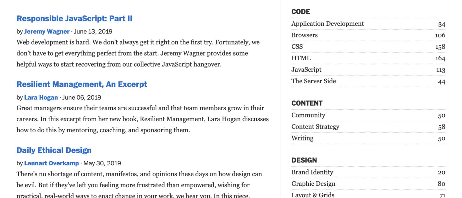
As a UI designer or developer, you are constantly dealing with an amazing and unpredictable element: the user. Users rely on your help to guide them through your website, frequently taking turns that you can’t anticipate.
What is a Navigation Menu?
The navigation menu is typically found at the top of each website, or both at the top and bottom of the screen. Clicking on a menu item brings up a list of related items. Users can make a selection by moving the cursor over the items and clicking on the desired choice.
Generally, global navigation represents the top-level pages of a site structure, or the pages below the home page.
- The main navigation provides an overview and answers important questions users may have when they first come to a site.
- It allows users to switch topics, helping visitors get to other sections of a site efficiently.
- Global navigation aids in orientation, helping users to understand where they are on a site.
- It also helps when users get interrupted while navigating and reminds visitors when they are on a site.
Make the Navigation Menu Usable.
Menus are a navigation method that allows users to go directly to specific parts of a website. Almost every good website has at least one menu. A useful feature is search, which helps users find further information not found in the main menu.
Usability refers to how easily and quickly a device can be learned and put to work. If it takes two minutes to figure out a menu, then it probably suffers from poor usability. However, if its purpose and use are immediately clear, then the menu has good usability.
It’s important to note that our definition of usability emphasizes “quickly” instead of “beautifully”.
One of the first things you learn in usability testing is that a system should be simple to use and fast.
Usability is more important than aesthetic splendor, as design and corporate branding can often conflict with usability. Time savings are also a more quantifiable measure of a design’s success compared to its alternatives.
Usability Problems
For example, if you give a user the task of finding a particular piece of information with your menu, you may discover that it takes extra time when the menu includes branding or other overhead.
However, we also aim to make the menu easy for users to use. If your menu is immediately readable and understandable, but the user has to position their mouse pointer in tiny squares to operate it, the menu is still not usable. This is illustrated in the example opposite, which has many problems, including mysterious wording and bad contrast. The biggest usability problem is that you have to click on the title to navigate to any subsection.

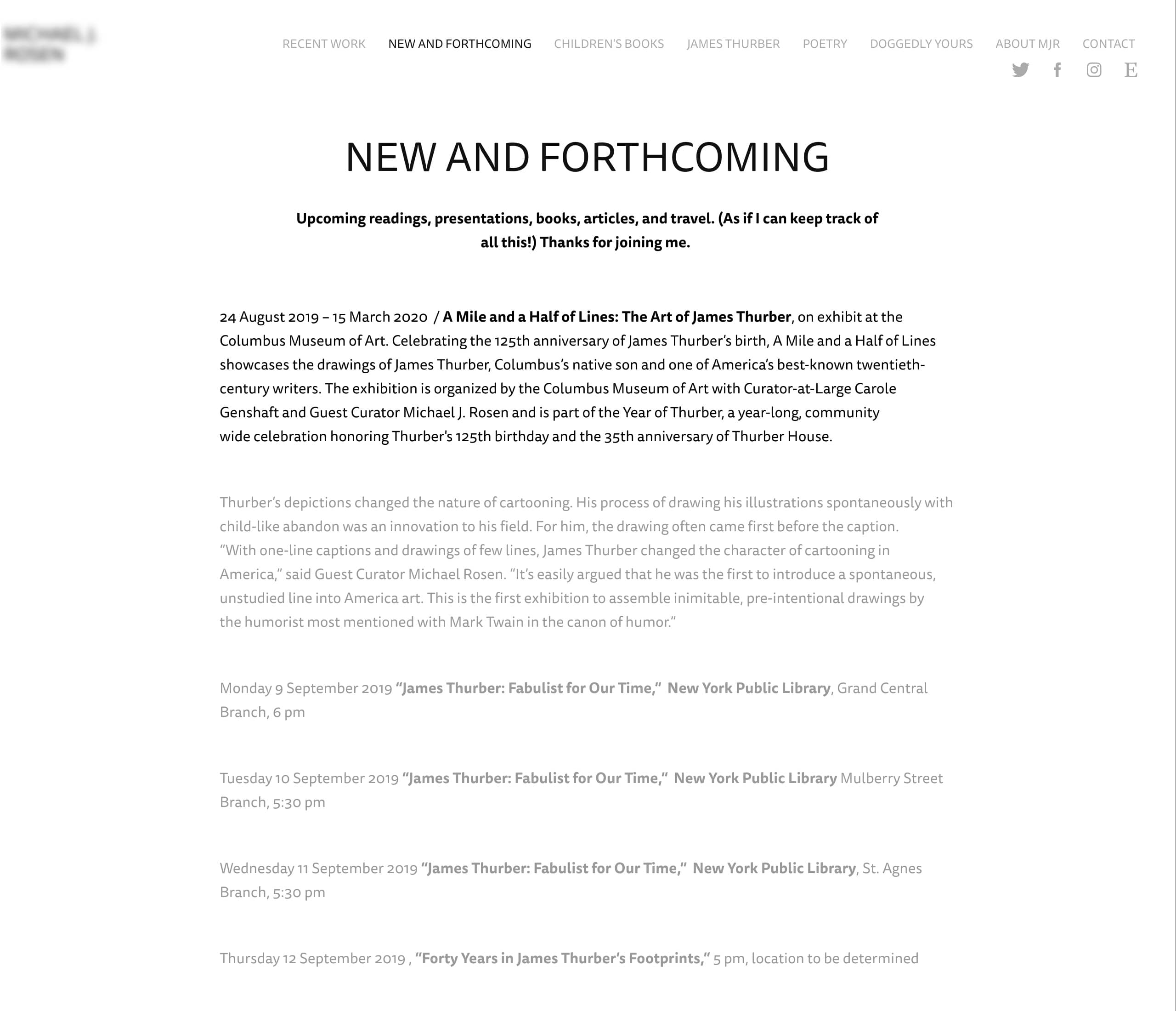
When we establish guidelines for good usability in web menus, we aim to make it easy and quick for users, who are often but not always customers, to navigate your website and complete their tasks.
Rules To Improve the Usability of Navigation Menus
This is not an exhaustive list of rules for designing a navigation menu, but they are certainly all factors you need to keep in mind when creating one.
Navigation Menus Should Take Into Consideration the User’s Primary Task
- Navigation menus should consider the user’s main task.
- They must be distinct from the content.
- The user should be able to easily scan the navigation menu for information.
- Navigation menus must be clearly readable.
- They should also be easy to operate.
- Navigation menus should load as quickly as possible.
- They must behave as the target user would expect.
- They must work on multiple browsers, just like the overall website.
- Navigation menus must be logical across the site.
- Usability should be prioritized over branding.
- They should show the user’s location within the site.
- Another important point is that they must be easily accessible.
Good Examples Of Global Navigation
WordPress.org
WordPress.org is a popular website platform that allows users to use it as a CMS. You can find more information about it at its official website.
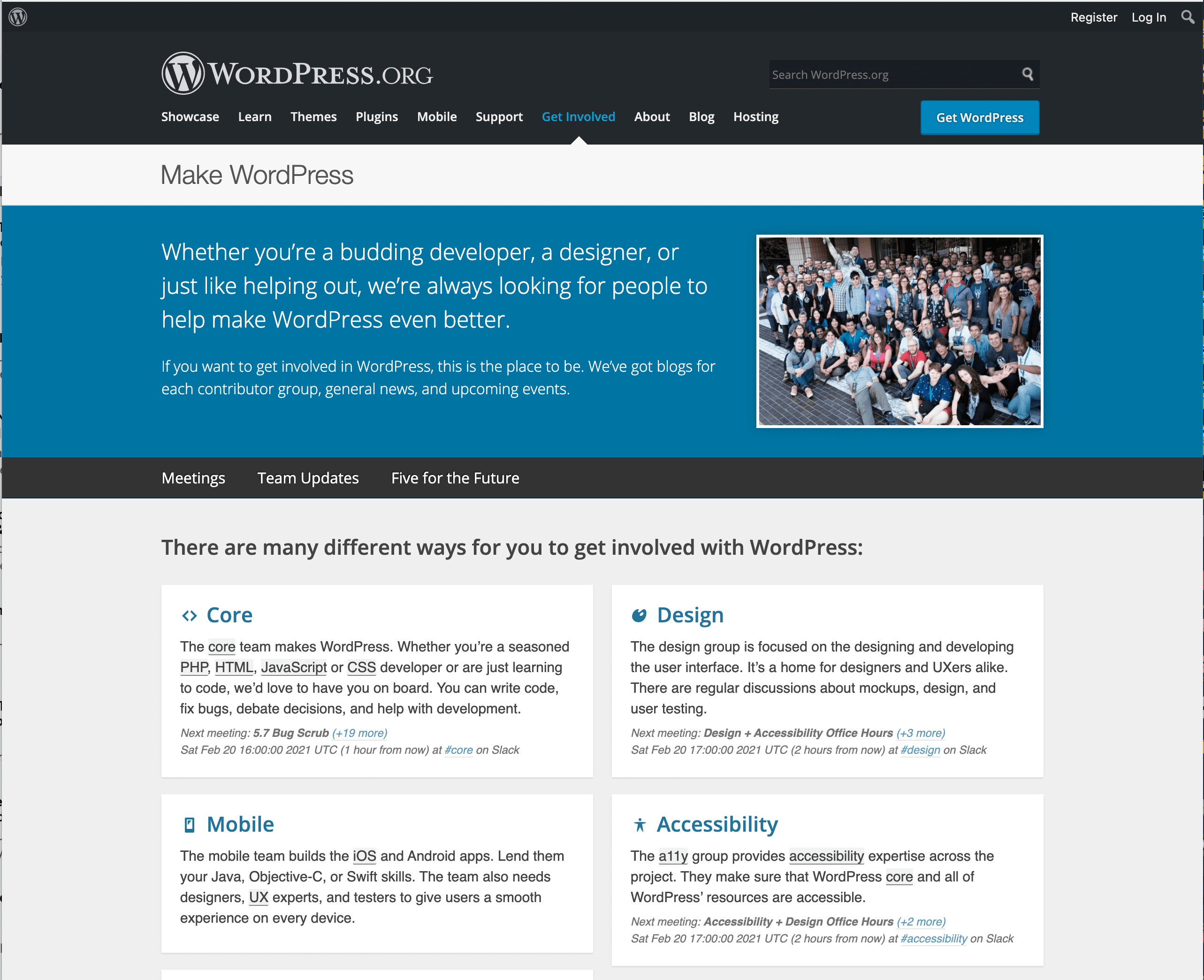
The global navigation of WordPress displays the location of the current page. This is achieved by changing the color of the selected page label. To draw extra attention to the user, WordPress uses an arrow to point out the selected label.
A-List Apart
A list Apart is a prominent online magazine for web design and web development.
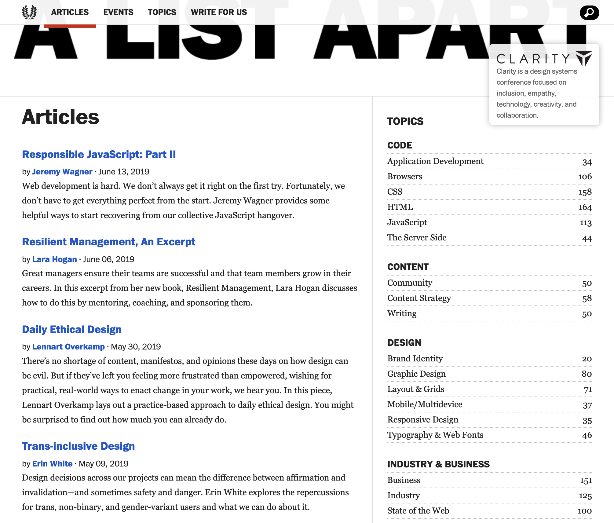
The navigation is kept to a minimum and unnecessary graphics are avoided. This feature allows readers to engage with the text without becoming distracted.
Amazon
Another example is Amazon, an American multinational technology company and one of the world’s largest online retailers.
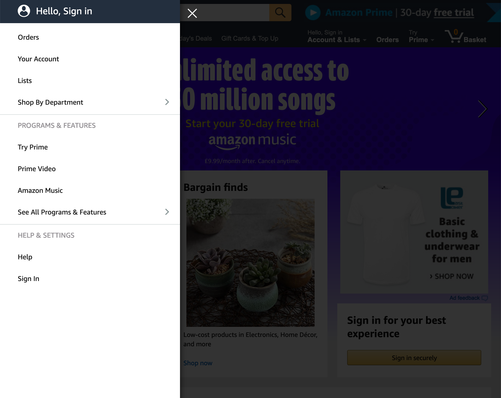
Amazon utilizes a vertical/sidebar navigation, which arranges items in a single column on top of each other. This type of navigation is a versatile pattern that can be found on virtually every kind of website. It can accommodate a long list of links and can be used alongside sub-navigation menus or on its own. It is easily applied to primary site navigation that contains a lot of links.
In Conclusion
It’s important to keep in mind that everything you publish on the web is intended for a user, and each user has unique background and real-world demands. Any efforts to make their web experience faster and easier is valuable to them, and ultimately to you.
By ensuring that the navigational structure is easy-to-use and clear, you can encourage visitors to spend time on your site. This also helps direct them to the content or features that are important to them and your business.